Best Website Design Trends in 2021

It is well known that trends come and go. Industries and media are significantly influenced by these trends, creating the need to adapt and evolve to keep up with them. Web design is no exception this year, considering minimalism and the importance of connecting with customers.
As mentioned above, trends (including web design) are constantly changing. From year to year, different industries tend to show diverse trends and relevant elements, which tend to apply to all sectors, like Pantone.
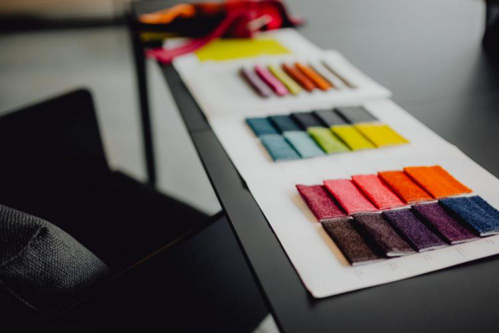
Pantone is an American corporation, which created the Pantone Matching System (PMS), a color identification system. This company, year after year, is in charge of determining the color or colors that will influence different industries, including the web design industry.
Having clarified this, we will be sharing the best trends for web design in 2021 so far in this blog.
Retro fonts
The nostalgia for vintage, and the recent popularity of bringing back trends that used to be popular, have led to this being reflected even in the virtual environment.
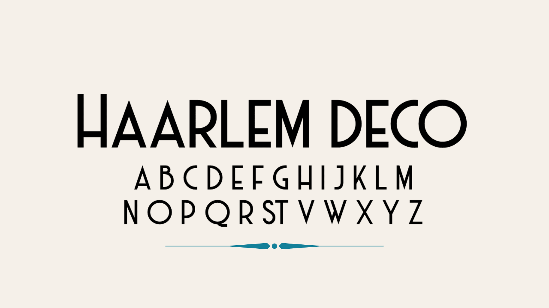
Classic fonts like Serif or more specific ones like Haarlem Deco are the most prominent. In contrast to how they used to be, these come strong in vibrant colors and with touches of neumorphism, which we will talk about next.
Neumorphism
Neumorphism is a trend that unifies two trends that we saw in the last two decades: Esqueumorphism (very detailed and more realistic icons) and Material Design (flat and simple icons.)
In this new trend, it takes the principle of flat and minimalist icons, usually in flat colors as well, but adding different techniques of shadows and lighting to create volume and relief in the elements to which it is applied, creating a clean, minimalist design but with the illusion of 3D relief.
From this new trend at the same time derives the 3D models, but applying this same concept. It gives a semi-flat appearance to buttons, bars, and even images and abstract figures that are part of a web page.
Full Height Homepage Hero
The "Hero" of a website is the storefront of your site. In them, you briefly show images, calls to action, or text that you want to show, referring to your brand, business, or services you offer.
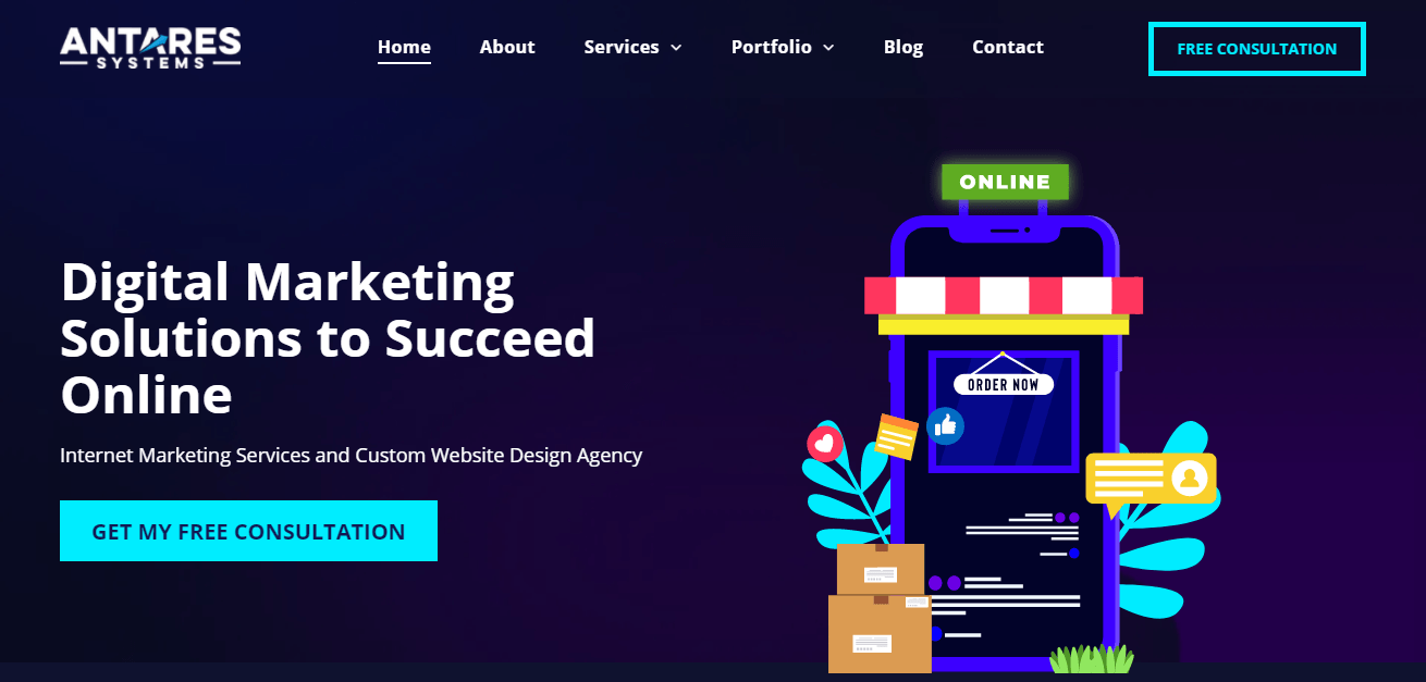
In recent times, the full-height hero has become popular. It covers the entire screen when loading the page, and we understand why: It is a great way to attract visitor's attention. Usually, a message is added that contains a short main message or something else that encourages visitors to learn more. We have even implemented it on our website!
Consider it a storytelling opportunity, create calls to action, grab the attention of your visitors with some attractive image or phrase to make your prospects feel interested in your site and your brand.
The 3D concept.
Derivative of neumorphism, how working with semi-flat colors and shadows has led to different outcomes and results. 3D elements have been created by playing with shades, colors, and illumination. As mentioned above, this trend in diverse website elements has led developers to think outside the box and look for new ways to innovate within this context.
Frosted glass effect
A clear example of the 3D concept is the frosted glass effect figures. This effect is applied in a simple way and to almost any element. It gives transparency and volume to them without losing the legibility of text or figures placed on top of it.
Three Dimension Colors
Another example of the 3D trend is the application of colors in the third dimension. With this, web designers seek to create more immersive and realistic spaces, playing with colors and shades but keeping it minimalist and organic.
Gradients
As a result of the three-dimensional colors and the frosted glass effect, we can find gradients in web interface designs. In this trend, we can see how vibrant and soft colors are combined in very striking combinations that revolutionize the concept of customer engagement. It creates a sense of movement, regardless of whether the element or image is animated or not.
This effect is helpful when creating minimalist sites since it highlights the simplicity of a website, or on the other hand, helps to emphasize simple elements when applied to the website in general.
When creating gradients, you should consider some points:
- Do not create random color palettes: this should be according to your business, products, or elements.
- Consider the contrast: A vibrant color palette can be tiring for the visitor, while a soft palette can lead to the user becoming visually bored. Try to mix it with your images or elements to make the user interested in what they see.
Minimalism
"Less is more." and of course it is! Minimalism is a trend that has gained momentum in absolutely all industries.
Minimalism is a concept that translates into simplicity, elegance, and sophistication. Too much of anything is not good, and this applies to websites!
A site loaded with color, elements or images, can be overwhelming to the eye, and with this, visitors can lose interest. While minimalism means leaving something as simple as possible, you must consider other concepts and textures (such as those we have already mentioned) to create clean sites full of color, attract attention, and lower the bounce rate.
Something to consider is that all the elements of your site, from fonts to colors, must have a purpose. That means not to be applied or used unless necessary to convey a message, create emphasis, or perform an action. Avoiding excesses is basic when talking about minimalism.
Immersive sensations
Due to COVID19, many people have become aware of the need to interact in general. Likewise, the need for a personalized experience is a "must" in today's world. Having mentioned all the previous trends, we can assume that these are of big help to keep the user immersed and interested in our website. Some other examples of things you can apply to your site and create unique experiences are:
- Online tours: Whether you have an architecture or construction website and that requires a personal visit, creating virtual tours or video tours allow you to show off your services, products, or work.
- Virtual demos: If you are a web designer like us, or you have a digital product you offer, you can provide small demos or snippets of it, allowing the user to have a preview. It creates a sense of customized attention, as well as an immersive experience.
- Online events: From webinars and courses to "lives" on social media or virtual platforms, online events have gained a presence over last year! It is a great way to keep in touch with your prospects and customers. Also, this helps to find out more about what they are interested in or would like to see on your social media or website.
- Interactive tools: From a simple cost calculator and chatbots to virtual stores, anything that makes it easy for the user to visualize, purchase or consume your products and services with just a touch helps create immersive situations.
- Get creative! There are many ways to create immersive situations and personalized treatment with prospects and customers. While these are just a few examples, other areas are a little more adventurous to explore. Such is the case of schools recreated in video games or virtual communities, or 360 images to show areas such as museums and open spaces.
The power of your website
Now, we already talked about the best web design trends in 2021. These translate into endless possibilities, creating fresh, creative, unique websites. It's worth mentioning that trends are constantly fluctuating, and adding them all to your site is not always ideal. If you think any of them are missing, don't be afraid to comment!
If you need help or someone to create your website in a way that is ideal for your business, or you want to implement any of these trends on your site, don't hesitate to contact us! We specialize in creating websites for small businesses. From local SEO optimization to innovative and attractive designs, ask for our web design service; the consultation is free!
This content reflects the personal opinions of the author. It is accurate and true to the best of the author’s knowledge and should not be substituted for impartial fact or advice in legal, political, or personal matters.


