How to Choose the Best Blog Layouts for Your Site

Choosing the Best Blog Layouts for Your Site
A well-designed blog can be the difference between a casual reader and a dedicated follower. But with so many different layouts and styles to choose from, how do you know which one is right for your blog?
Here are a few things to consider when choosing a layout for your blog:
- What Is the Purpose of Your Blog?
- Who Is Your Target Audience?
- What Kind of Content Will You Be Creating?
- A business blog design VS personal blog design
- How Much Time Are You Willing to Spend on Design and Maintenance?
- Types of blog layouts
- Masonry Layout
- Column Layout
- Two-Column Layout
- Grid Layout
- List Layout
- Blog card Layout
- Magazine Layout
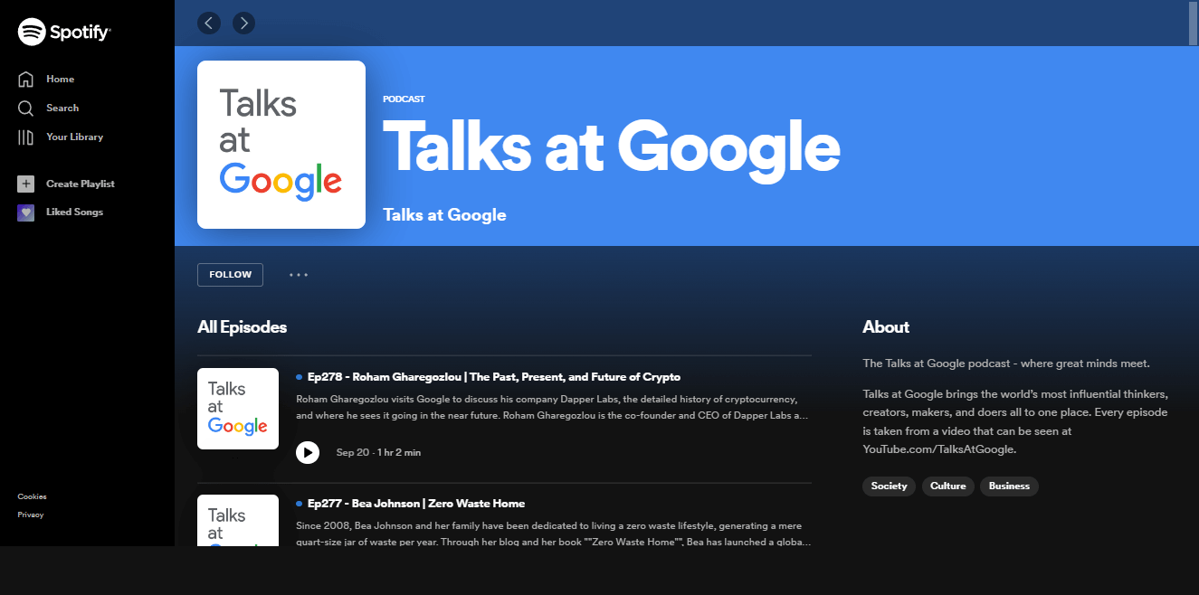
- Podcast Layout
- Other things to consider for your blog layout
- Custom blog design for every business website
What Is the Purpose of Your Blog?
Before you can choose a layout, you need to understand the purpose of your blog. Are you using it to build a personal brand? Are you using it to generate leads for your business? Or are you using it as a platform to share your thoughts and ideas with the world?
Once you know the purpose of your blog, you can start narrowing down your layout options. For example, if you're using your blog to build a personal brand, you'll want a layout that puts your photo and bio front and center. But if you're using your blog to generate leads, you'll want a blog layout that includes prominently placed CTA buttons.
Who Is Your Target Audience?
Your target audience will also play a role in choosing the right layout for your blog. If you're writing for a broad audience, you'll want a clean and simple layout that's easy to navigate. But if you're writing for a niche audience, you can be more adventurous with your design without turning off potential readers.
Also, your blog design should reflect the tone of your writing. For example, if you're a lifestyle blogger with a fun and upbeat personality, you'll want a layout that's lighthearted and cheerful. But if you're a business blogger with a more serious tone, you'll want a layout that's clean and professional.
What Kind of Content Will You Be Creating?
The type of content you'll be creating will also influence your choice of layout. If you plan on including a lot of visuals in your blog post (e.g., infographics, photos, etc.), then you'll want a blog page that can accommodate those visuals.
On the other hand, if you'll be creating mostly text-based content, then you won't need as much space for visuals. In this case, you might want a layout that includes a sidebar so you can include additional information and links.
A business blog design VS personal blog design
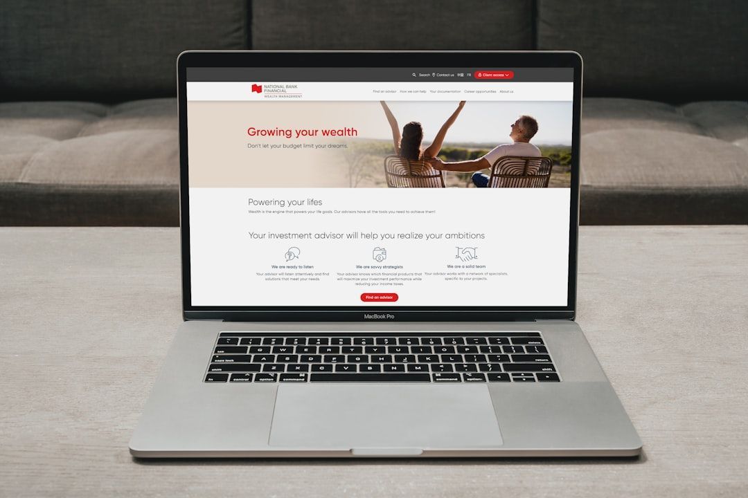
When it comes to choosing a blog layout, businesses have different needs than personal bloggers. A business blog is typically used as a marketing tool to generate leads and drive traffic to a company's website. As such, business blogs need to be designed with conversion in mind.
That means including prominently placed CTA buttons and ensuring that the layout is easy to navigate. Personal blogs, on the other hand, are more focused on building a personal brand and providing a platform for self-expression. As such, personal blogs can be more creative and experimental with their designs.
A great blog layout must be:
1) visually attractive
2) easy to navigate
3) conducive to the type of content you'll be creating
4) reflective of your target audience
5) aligned with the purpose of your blog.
With so many different layouts to choose from, it can be tough to decide which one is right for your blog. But by considering the factors above, you can narrow down your options and choose a layout that will help you achieve your blogging goals.
How Much Time Are You Willing to Spend on Design and Maintenance?
Finally, you need to consider how much time you're willing to spend on design and maintenance. If you're not averse to spending a bit of time tweaking your blog's design, then you can opt for a more complex layout.
But if you want something that's quick and easy to set up, then you should choose a simpler layout. Once you've considered all of these factors, you'll be able to choose the best blog layout for your site.
Types of blog layouts
Every successful blog must be visually appealing, functional, and easy to navigate. But with so many different types of blog layouts to choose from, it can be tough to decide which one is right for your site.
Here's a look at some of the most popular types of blog layouts:
Masonry Layout
Masonry is a popular layout for blogs and portfolios. This style of layout arranges your content in grid-like fashion, with each new piece of content fitting snugly into place. Masonry layouts are often used on image-heavy sites (photography blog, travel blog), as they provide an elegant way to display a large number of photos. However, masonry can also be used for text-based content. If you're looking for a clean, minimalist look, masonry might be the right layout for you.
Column Layout
Column layouts are one of the most common types of blog layouts. In this type of layout, your content is arranged in columns, with each new piece of content appearing below the last. Column layouts can be used for both text-based and image-based content. If you're looking for a simple, straightforward layout, columns might be the way to go.
Two-Column Layout
Two-column layouts are similar to column layouts, but as the name suggests, they include two columns of content instead of just one. Two-column layouts are a great way to include more content on your page without making it feel too cramped or cluttered. This type of layout is often used for text-based content, as it provides a way to include more information without sacrificing readability.
However, this type of layout can also be used for image-based content. If you have a lot of visuals that you want to include on your site, a two-column layout can be a great way to do it. This blog layout type is not as common as the other we mention, but it can be used to great effect if done well.
Grid Layout
Grid layouts are similar to column layouts, but with a few key differences. First, grid layouts often have more than two columns. Second, grid layouts are based on a modular system, meaning that each piece of content fits into place like a puzzle piece. This makes grid layouts very versatile; they can be used for everything from simple text-based blogs to complex image galleries.
If you're looking for a layout that's a bit more flexible and versatile than a column or two-column layout, then a grid layout might be right for you.
List Layout
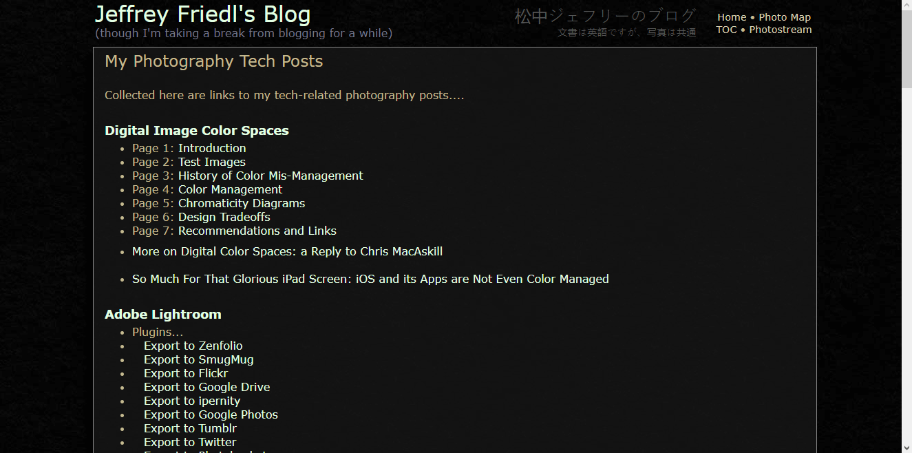
List layouts are one of the simplest and most common types of blog layouts. In this type of layout, your content is arranged in a list, with each new piece of content appearing below the last, as one column layout. List layouts are often used for text-based content, as they provide a way to include a lot of information without sacrificing readability. However, this type of layout can result in a non-visually appealing blog, since it can be difficult to break up the text and make it look pleasing to the eye.
If you're looking for a simple way to arrange your content, a list layout might be right for you. However, if you're looking for a more appealing blog, you might want to choose a different layout.
Blog card Layout
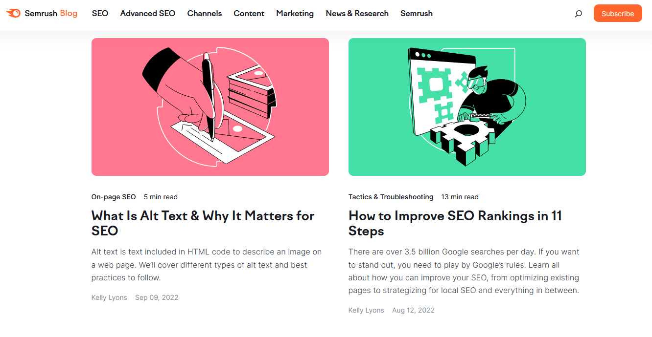
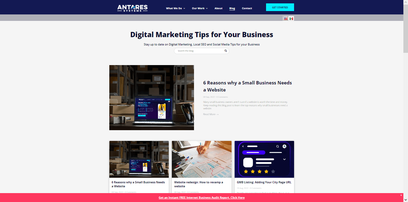
Blog card layouts are becoming increasingly popular, especially for image-based blogs. In this type of layout, your content is arranged in "cards," with each new piece of content appearing as a separate card. This type of layout is great for blogs that rely heavily on visuals, as it provides a way to showcase a lot of images without sacrificing readability.
This type of layout is similar to the grid layout, but with a few key differences. Blog card layouts often include article quick summary boxes on the front of each card, whereas grid layouts typically do not. In addition, blog card layouts are usually designed to be responsive, meaning they will automatically adjust to different screen sizes. This makes them a great choice for blogs that are viewed on mobile devices.
If you're looking for a layout that's both appealing and mobile-friendly, then a blog card layout might be right.
Magazine Layout
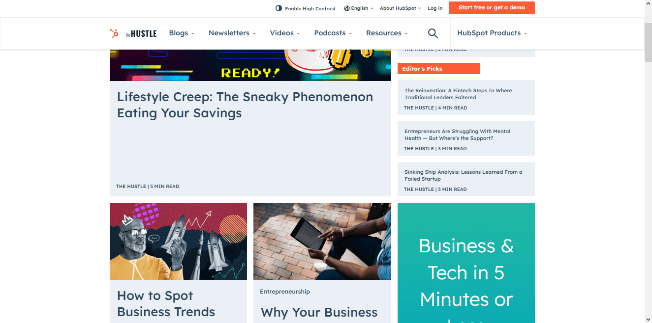
Magazine layouts are similar to column layouts, but with a few key differences. First, magazine layouts often have more than two columns. Second, magazine layouts are designed to be visually attractive, with attention-grabbing headlines and images. This type of layout is often used for news-based blogs, as it provides a way to include a lot of information without sacrificing readability.
If you're looking for an attention-grabbing, visual way to layout your blog, then a magazine layout might be right for you.
This kind of layout displays content in different ways, highlighting featured images, headlines, and categories. This is a great way to show off different kinds of content, especially if you have a lot of visuals and blog content to work with.
Podcast Layout
Podcast layouts are similar to column layouts, but they're specifically designed for audio content. In this type of layout, your content is arranged in a player, with each new piece of content appearing as a separate episode.
This type of layout increased in popularity with the rise of podcasts, and it's a great way to showcase audio content. Is more commonly used in podcast and audio-based platforms, this type of layout can be difficult to find elsewhere.
Other things to consider for your blog layout
Now that you know some of the most popular types of blog layouts, it's time to choose the right one for your site. Here are a few things to keep in mind as you make your decision:
- Use high quality images: Images are an important part of any blog layout, so make sure to use high quality images that are relevant to your content. This applies to blog thumbnails, featured images, and any other images you include in your posts.
- Choose mobile friendly blog designs: Responsive layouts adjust to different screen sizes, so make sure to choose a layout that's responsive to ensure that your blog looks great on all devices. Mobile friendliness is also important for SEO.
- Choose a layout that highlights your blog posts: Your layout should highlight your popular blog articles and make them easy to find.
- Consider negative space: Negative space (or white space) is the empty space around your content. It's important to consider how much negative space you want in your layout, as too little can make your blog look cluttered, and too much can make it look empty.
- Consider article quick summary boxes: Article quick summary boxes are a great way to give readers a taste of your content without them having to click through to the full article.
- Implement a search bar: Search bars are a great way to help readers find the content they're looking for on your site, to select the blog categories, and to sort through the archives.
- Consider social media integration: Social media integration is a great way to promote your content and connect with readers.
- Keep it simple: When it comes to blog layouts, simpler is usually better. A complex layout can be confusing and overwhelming for readers, so it's important to keep your layout simple and easy to navigate.
- Be careful, since a too simple layout can look boring. Try to find a balance between simplicity and visual appeal.
- Test your layout: Once you've chosen a layout, make sure to test out your own blog on different devices and screen sizes to make sure it looks and works the way you want it to. You can also ask friends and family to test out your layout to get their feedback, from how it looks to how easy it is to navigate.
There are a lot of factors to consider when choosing a blog layout, but if you keep these things in mind, you'll be sure to find a layout that's right for you and your blog.
What is your favorite type of layout? Let us know in the comments below!
Custom blog design for every business website
Choosing the right layout for your blog doesn't have to be complicated. By keeping these simple tips in mind, you can select a layout that's sure to please both you and your readers.
At Antares Systems, we offer custom blog design services that are perfect for any business website. Our team of expert designers will work with you to create a unique and appealing layout that's tailored to your specific needs and goals.
Contact us today to learn more about our
custom website design services, or visit our website to learn more about our other services. We look forward to helping you create a successful and attractive blog!


